
Design
Anatomy of a High-Converting Hero
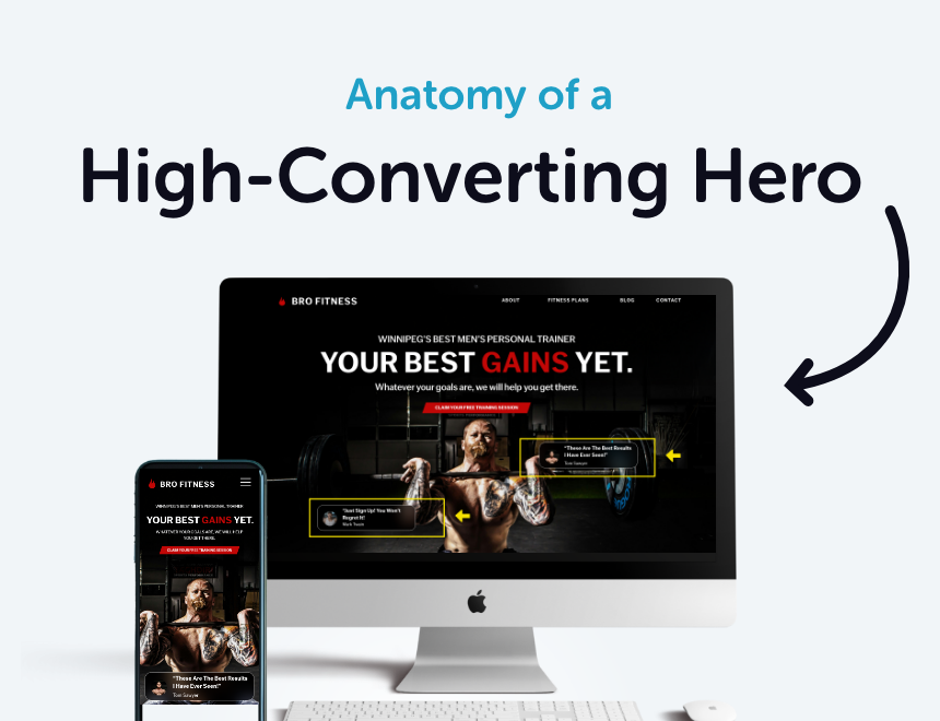
What is a Hero?
Your hero section is your website’s first impression—and let’s be real, first impressions matter. It’s that big, bold section at the top of your homepage, the first thing people see when they land on your site.
It’s usually very visual, but let’s not forget—the copy and other elements are just as important (if not more!). A solid hero grabs attention, clearly communicates what you do, and guides visitors toward action—whether that’s clicking, scrolling, or exploring further. It should be clear, engaging, and instantly impactful.
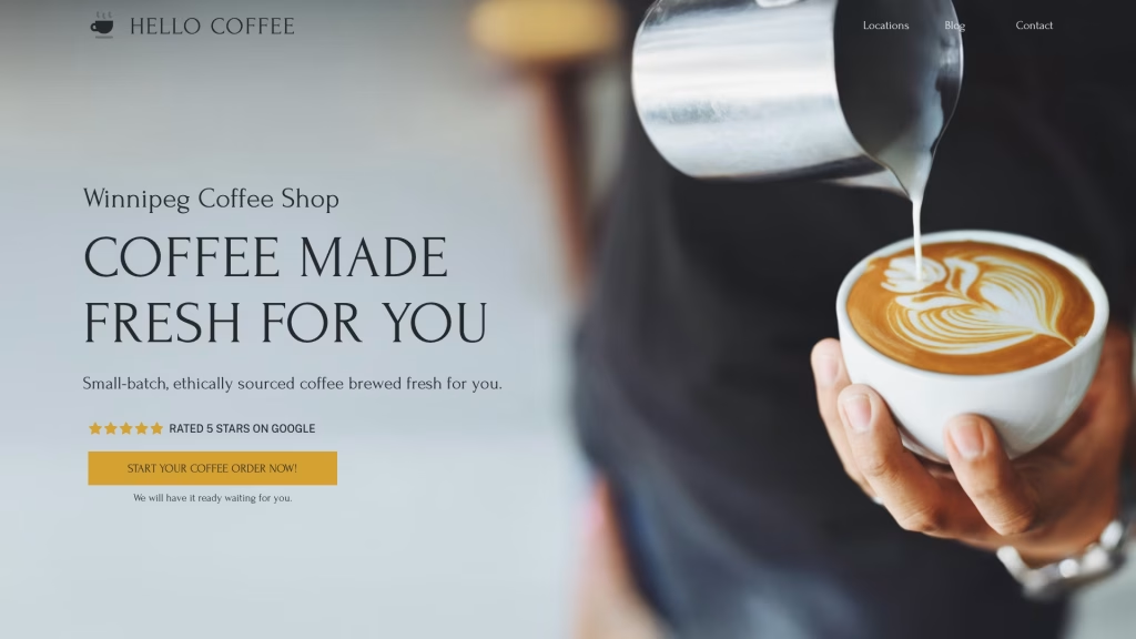
Step 1: Define Your Audience
Before designing an effective hero section, you need to know who you’re talking to. The hero isn’t about you—it’s about your customer.
Ask yourself:
- Who is my ideal visitor?
- What problem do they need solved?
- What action do I want them to take?
Once you have a clear picture of your audience, you can craft messaging that speaks directly to them.
Step 2: Craft the Message That Hooks Them
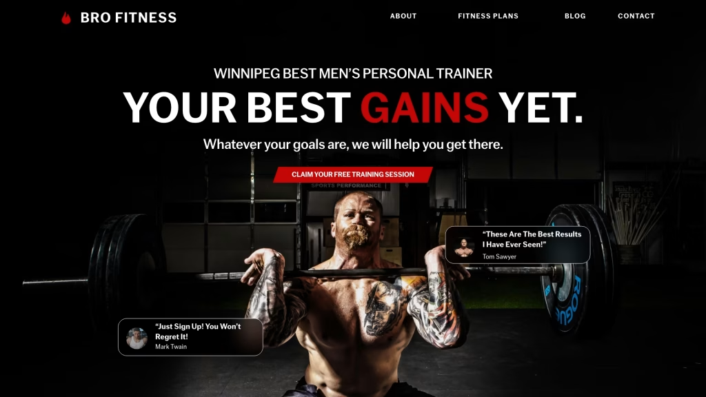
Think of your hero messaging like an elevator pitch—you’ve only got a few seconds to make an impact, so make it count.
Here’s my go-to formula:
1. H1 Tag (Your Focus Keyword)
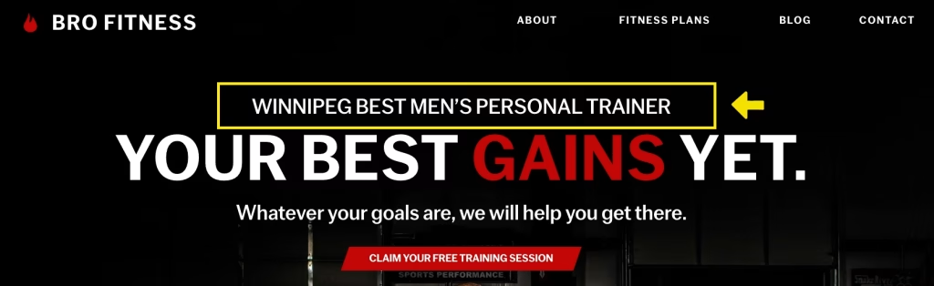
This one’s mostly for SEO, so let’s be honest—it’s not always the most captivating of text. That’s why I usually style it smaller so it doesn’t steal the spotlight.
2. Headline (The Hook)
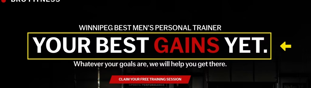
This is the big, bold statement that tells people what you do and how you help—in as few words as possible. No vague, fluffy nonsense.
🚫 “Innovative Solutions for a Better Tomorrow” (What does this even mean?!)
✅ “Launch a Website That Converts—No Templates, Just Results” (Now we’re talking!)
3. Supporting Text
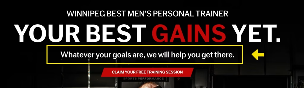
A short sentence or bullet points explaining key features or how your service works. Keep it concise and scannable.
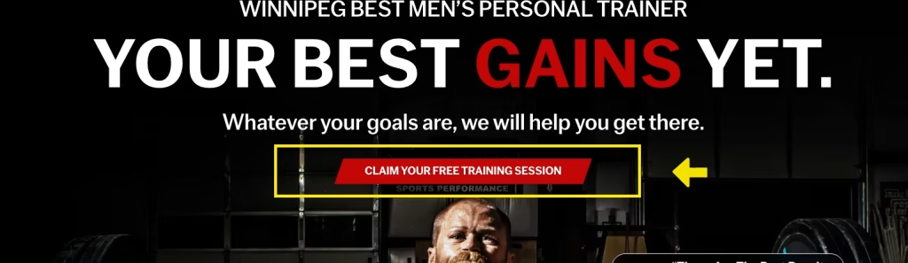
Step 3: Make the CTA (Call-to-Action) Button Obvious
This is the button we want people to click—so don’t make them hunt for it.
- Be Crystal Clear – Tell them exactly what to do (e.g., “Get Your Free Quote” instead of “Learn More”).
- Use High Contrasting Colors – Make your CTA button stand out.
- Design that supports it – Everything in your hero should support and guide attention to the CTA.
Step 4: Build Trust with Add-Ons
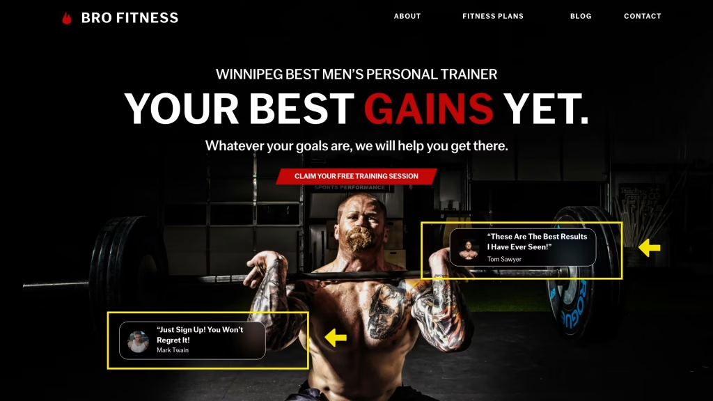
Once you’ve nailed the message and CTA, add elements that reinforce credibility, such as:
- “Trusted by 100+ businesses”
- Certification logos or awards
- Client testimonials
These small touches can boost conversions by making visitors feel more confident in your offer.
Step 5: Pick the Right Visuals
Your visuals should support your message—not just look pretty. That’s why I recommend crafting the messaging first and choosing visuals that reinforce it.
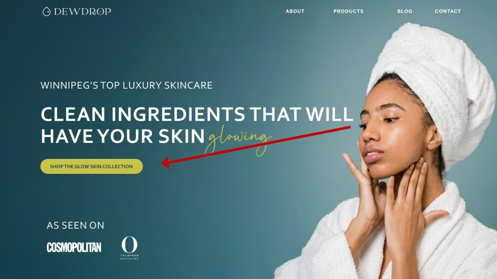
This hero features a model looking towards the CTA and builds trust with logos that people recognize.
Best-Converting Layouts:
- Text on the Left, Image on the Right – We read left to right, so put the most important info first.
- Centered Layout – Great for bold, simple messaging.
Choosing the Right Imagery:
- Match your brand’s vibe (colors, tone, and style).
- Use models wearing your brand colors for a cohesive look.
- Guide the eye toward the CTA (e.g., models looking at or pointing to the button).
- Angle product shots to subtly direct attention to your call-to-action.
Common Hero Mistakes to Avoid
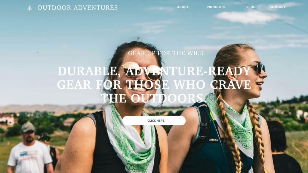
This hero is hard to read with the text overtop of their face and low contrast between the text and the background.
- Text Covering Faces – People naturally focus on faces, so don’t place text over them.
- Slow Load Times – Size your images correctly and use nextgen image formats and avoid heavy video backgrounds.
- Poor Contrast – Always check readability with a contrast checker.
- Too Much Clutter – Too many elements in a small space make it hard to read.
Final Thoughts
Your hero section isn’t just a pretty banner—it’s your chance to hook visitors and get them to take action. Keep it focused, user-friendly, and conversion-driven, and you’ll have a hero that works for you!